| Image |
Thoughts |
Links |
 |
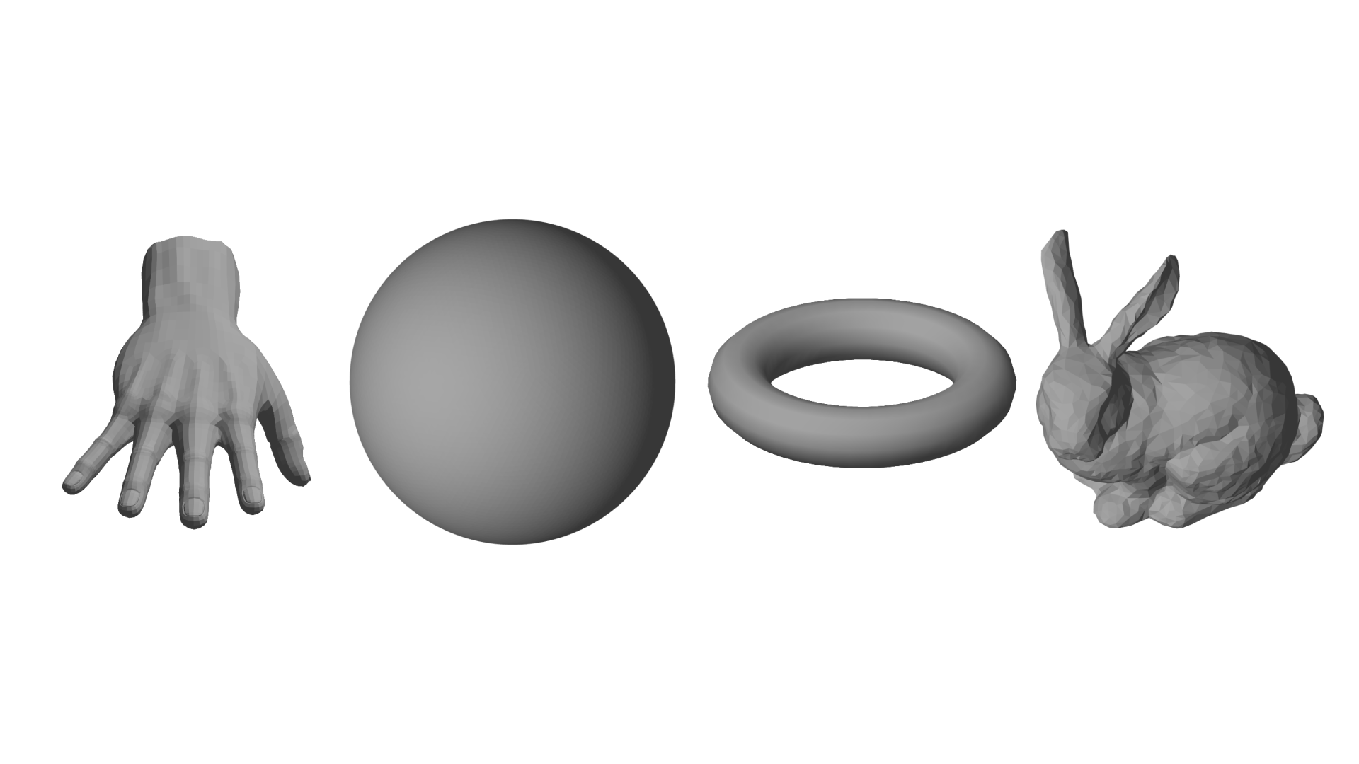
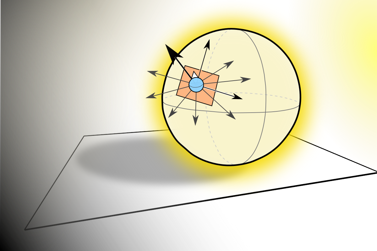
I wanted to create an image making technique based on a model of human perception, where everything gets decomposed into a plane, which is the extent to which we can discern spatial information. I imagined that perhaps shape was seen as variations of normals and maybe our eyes discretize them into regions of equal normal in 3 dimensions. The sphere came out roughly like I imagined that it would, although I would personally prefer more precision and think that the "biological impressions" of the work lend some texture, but do not aid in communicating the message that I was going for. |
More Images |
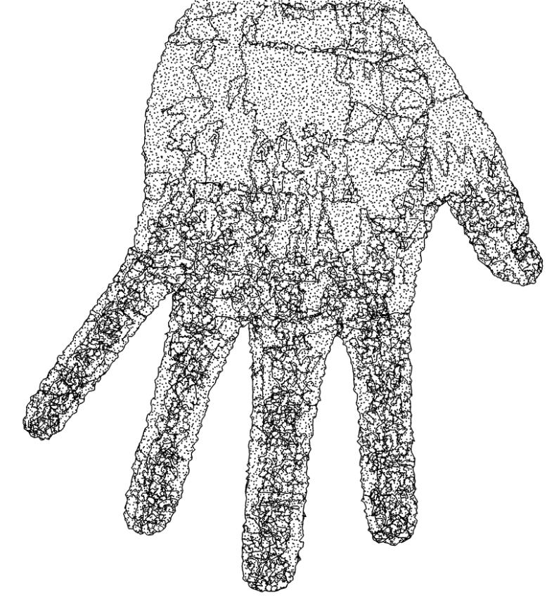 |
I tried the technique out on a hand mesh, but it came out technically sensible, but aesthetically unreadable. I suppose that it would eventually work given a subdivision model of a hand, but that is a research project for future years. |
More Images |
 |
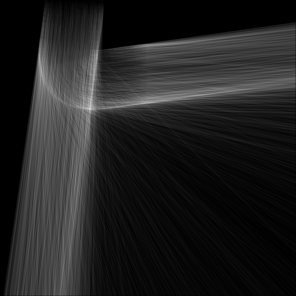
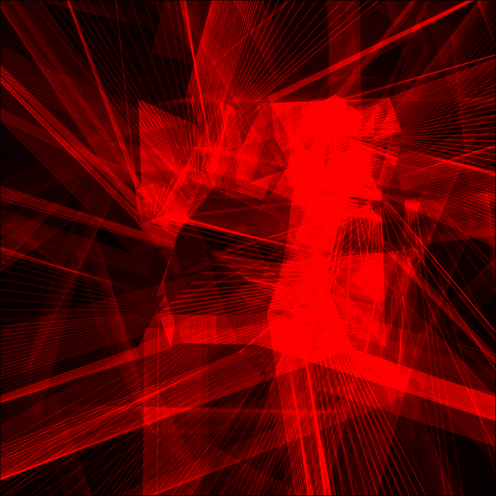
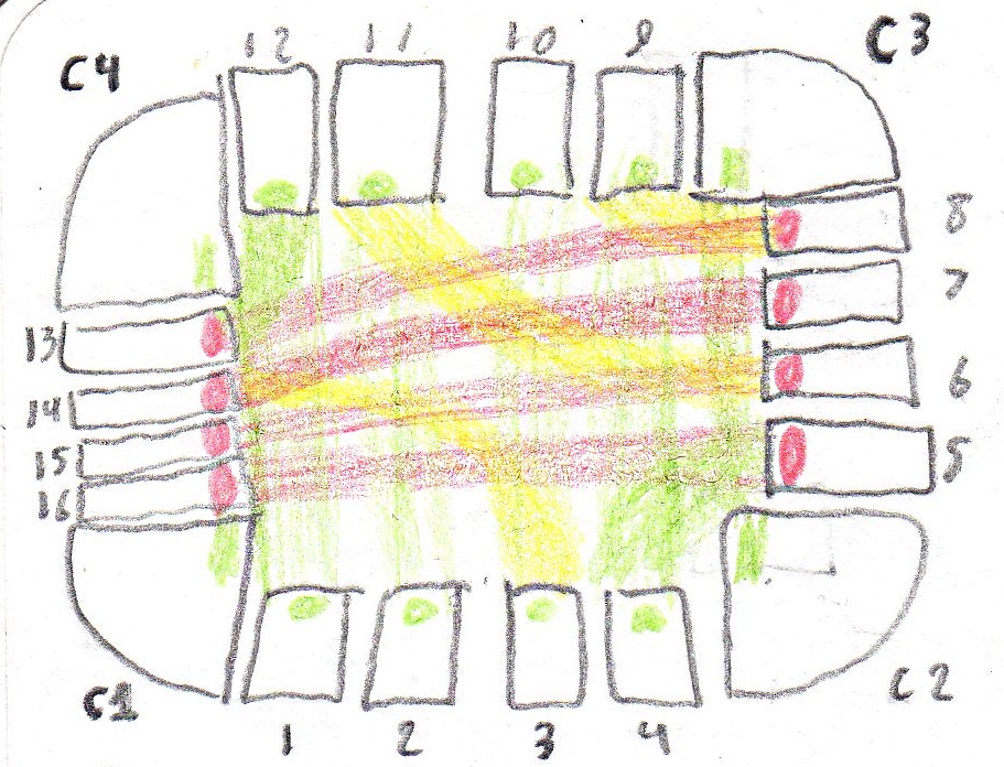
After I finished working with meshes and line divisions, I tried to get closer to visualizing paths, which are how the rational part of my mind sees the world, where it models the actions and behavior that it sees into systemic structures. Later on I was advised to focus more on what I saw, rather than what I thought that I saw. I made this image at a healthcare makerthon, where we were tasked with reinventing the EKG data visualization that is commonly used to read how well a person's heart is performing. I mad this image that shows the circulations of the electrical waved through the various parts of the heart. With more work it could be cleaned up and aligned with data streams, but for now I'm glad of how it worked out. An interesting note is that this was my first experiement with dividing up an image frame using relationships, rather than hardcoded values. Each chamber has no definate size, but they are defined as subdivisions and orthogonal relationships between one another. This technique was used in the Woodhull image, which you shall see later. |
A few related images. |
 |
Back to biology land, I thought that I could overcome the limitations of the pixel by creating 9 impression groupings that show both a value and a direction. I did a lot of brainstorming and musing on the nature of impressions, feelings, meanings, and social norms in regards to tiny circles. If there is a practical internal theoretical insight that I personally gained from this process, then I don't think that I was able to translate it into a surprising revelation on the image plane. |
More images. |
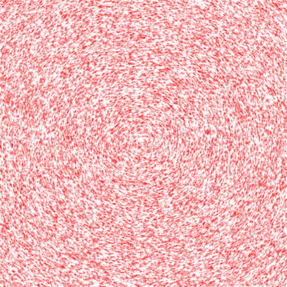 |
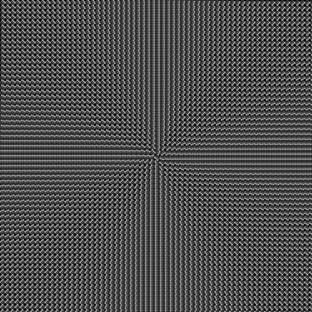
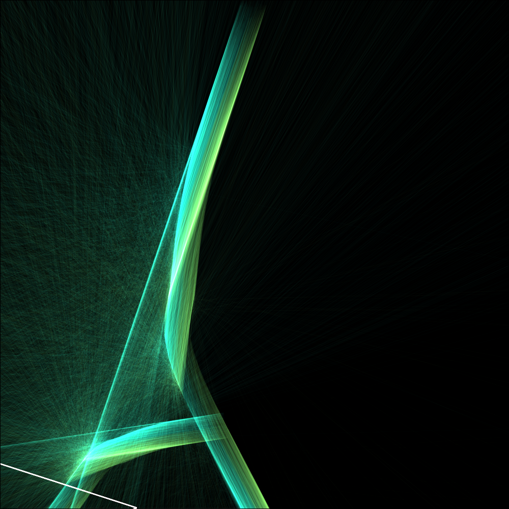
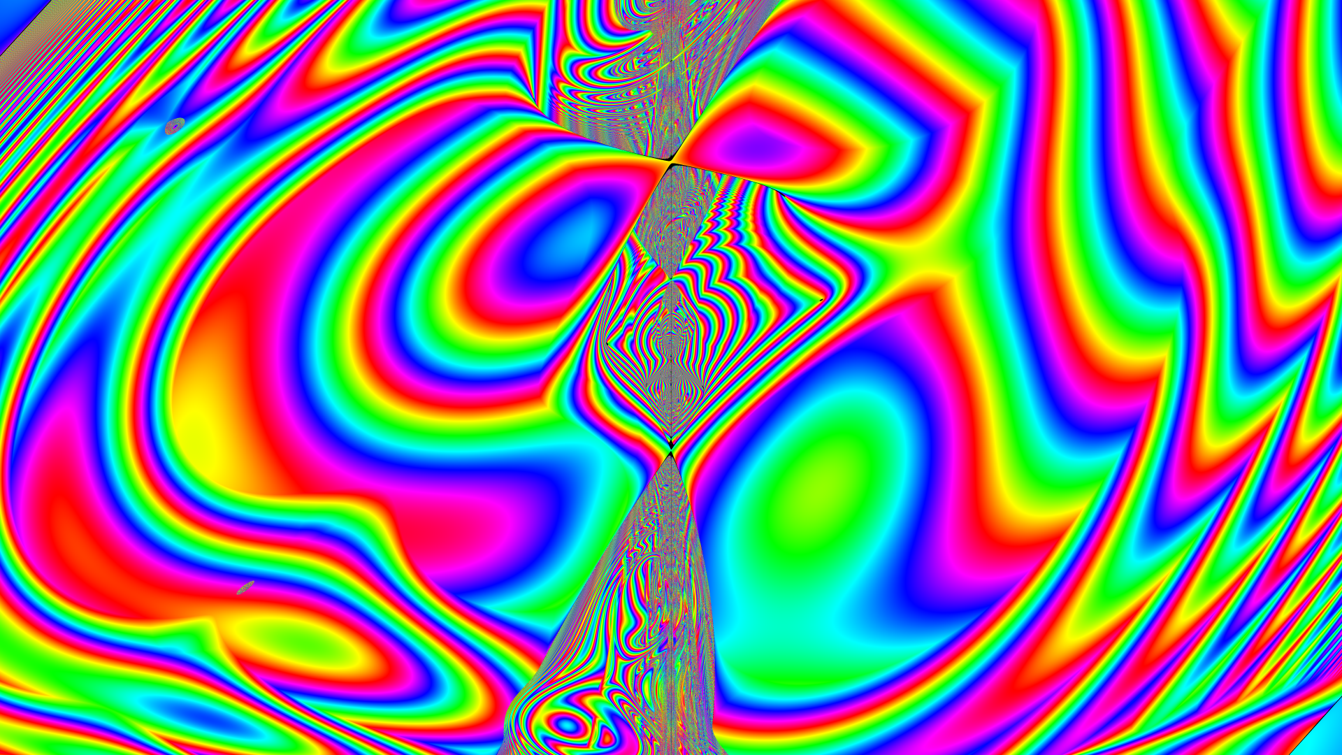
Staying on the subject of directionality, I continued to investigate vector fields on the plane. I desired to figure out ways to fill in and texture a space I wanted something that had directionality, depth, and was modular in that it was not problematic if parts were moved or blocked off. Sometimes I think that I've spent too much of my life fixated on 2D textures, but I think it will pay off someday when I figure out my projective geometry work. Along the way, I'm gaining more experience with Vector Algebra, including gradient free circulation fields, that can be used to conserve fluid. |
More images. |
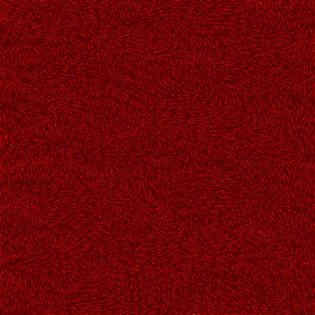 |
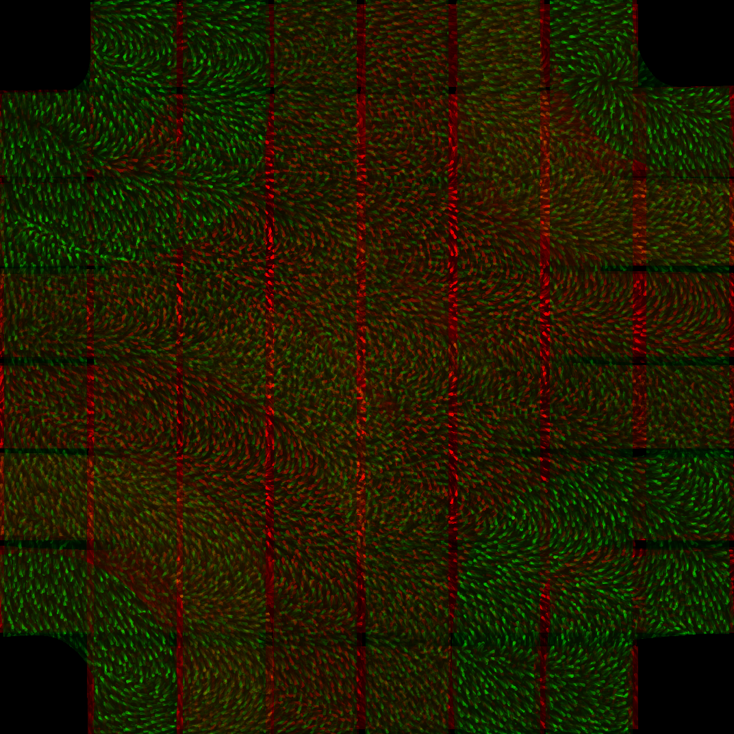
I continued along the noise field path, until I started using simpler forms and eventually came to this carpet texture, which was a result of a conservative vector field and getting the directionality procedure just right. I wish that it was brighter though. Brightness is something that I need to work on in my image making work, because too bright and the piece loses details and jars the eye. Too dark and the details are not visible. Also, since I read the texture as a carpet, I will need to keep going to find a method of directionality that is beautiful to me, but is more like a master craftsman's paint stroke, rather than a carpet simulation. I like conservative vector fields, because like the division of a plane, they are ideally aesthetically interesting, without having a definate form, but rather filling an entire region with interesting detail. |
More images. |
 |
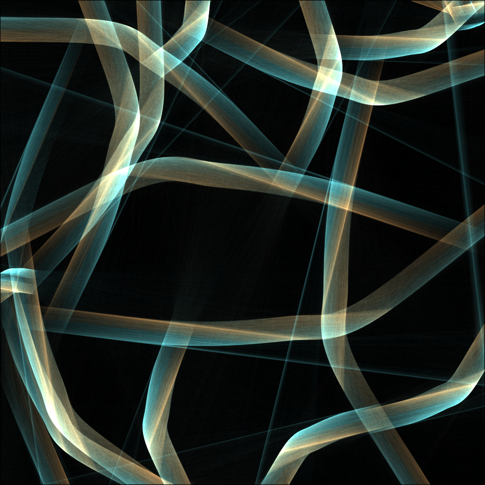
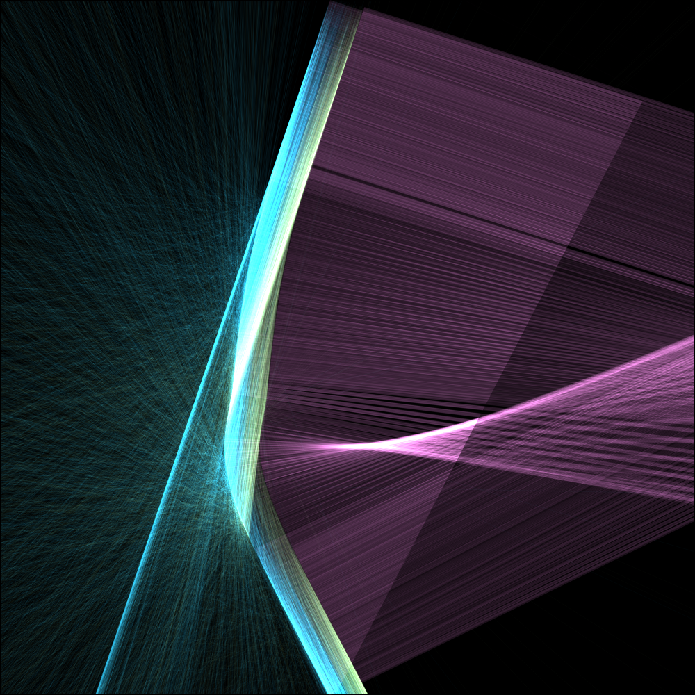
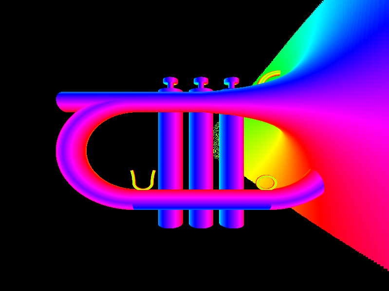
Now that I was happy for the most part with my carpet texture, I moved on to form. I worked out the mathematics for constructing a spline and imagining the interior as a vector field that flows along the curve. In order to visualize something specific, I took a traffic intersection pattern, where 2 four lane roads meet with sidewalks and colored all of the allowed potential paths green, those that must yield yellow, and those encumbered by the flow of traffic red. The blending was not perfect and I think I blended these together using Paint.net
| |
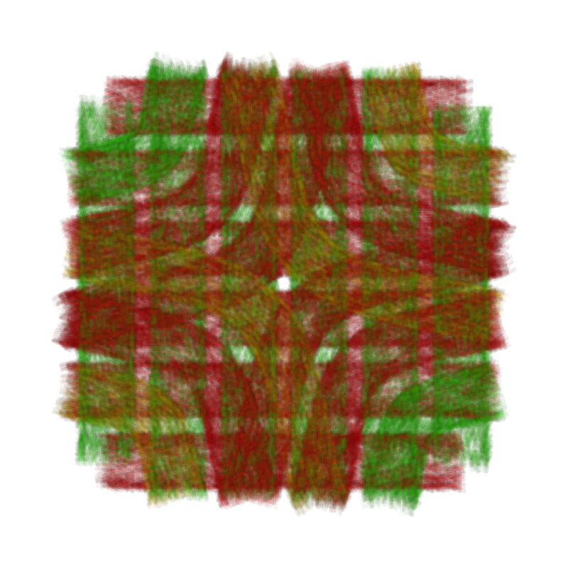 |
After conceptualizing the intersection of paths, I worked out the mathematics for seemlessly blending impressions of various colored paths in 1 layer computationally. Later I've gone back and realized my vision for illustrating the potentialities and rules of a traffic intersection consisting of 4 lanes of automobile traffic and sidewalks for pedestrians. This is an example of an image that I can make using my path mathematics, that I could not make by compositing and blending carpet textures in Paint.net such as in the image previous.
This particular style of overlaid blending allows for the paths of traffic flow to be perceived as they are with their spatial extents and their color, rather than a wash of blending like that found in the previous image. I might want to reapply this technique to some of the later images to solve the problem of light oversaturating to white.
|
More images.
Sketch. |
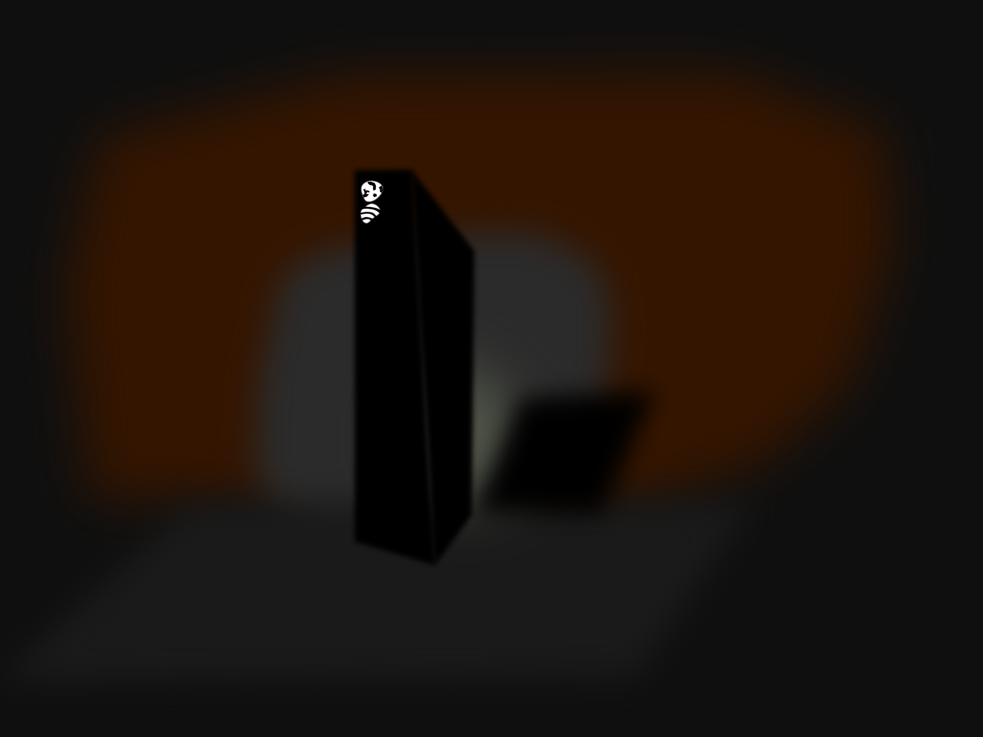 |
Color. I worked on visualizing the world as I saw it, rather than as shown to me through machine mediation. If you ever take a picture on a cell phone, you will see that it doesn't capture the actual colors and beauty that you the person is seeing. I decided to search out some aesthetically interesting sites, such as this router on a refrigerator. While extreme dark lighting conditions are difficult for a camera to capture due to noise, my mind is better able to interpret the subtle lighting that makes up this scene. I probably am attached to this router, because it took me over a month to get it working and providing internet. |
More images.
Sketch |
 |
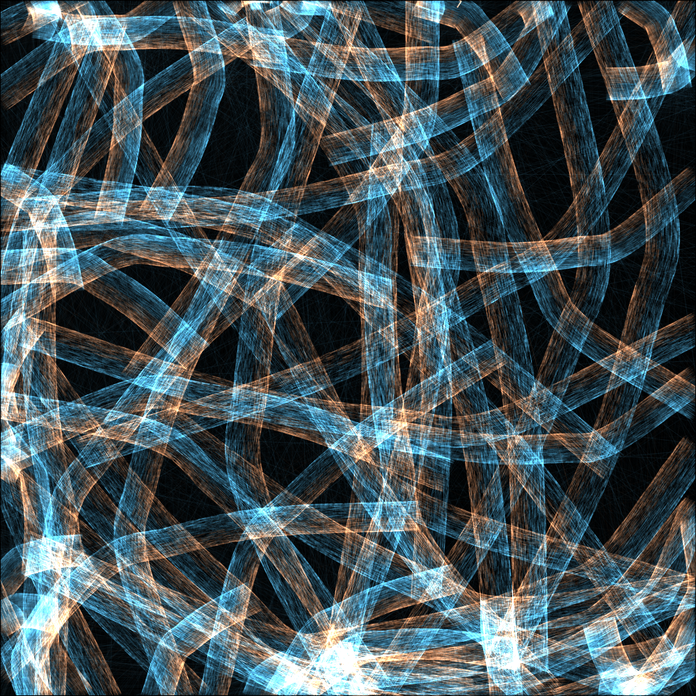
Interaction of color. Back in the day I did a project called travel world, where I arranged a computer game in a grid world, where lights are transfered across neighboring grid cells. Using Inkscape, I mocked up a new version of this radiosity idea using polygons and I tried to select colors that appealed to me. |
More images.
Travel world. |
 |
Putting color and structure together, I created an image about my favorite building in Brooklyn. I call it the beautiful factory, others call if Woodhull Hospital. I'm attached to this building because it is dramatic, beautiful, and representative of my first year in New York City. I used paths, colors, and the spatial decomposition scheme that I developed during the Makerthon. I like how it turned out and it is a good work of grid based formal decomposition. It doesn't use the paths well however, because there is no point in working out the directionality mathematics if the paths are just going to be put on orthonormal trajectories anyway. |
More images. |
 |
Big red rock eater. I call this image the big red rock eater. My father used to always tell me a joke about big red rock eaters that went like this, "What is big and red and eats rocks?", "I don't know.", "A big red rock eater. What is big and blue and eats rocks?", "A big blue rock eater?", "No, they only come in red!" This is an image of my father I guess, although it could use more work. It is based on a branch tree pattern of paths, the colors were chosen from a tree with its leaves glistening in the autumn wind. There was a shade of red on the sun side, the shadowed side, and another facet in between. I think that it needs to look more like a walking star wars machine though. Right now it lacks any definate form. It is the right color for Thanksgiving though. |
More images. |
 |
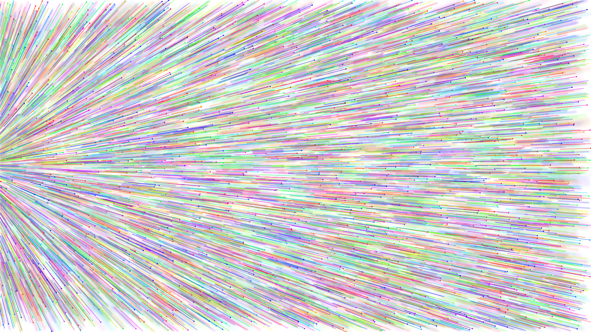
For the final push before I hibernate for the winter, I went back to old fashion java programming and my 2D fluence light beam rendering system with its irradiance caches. I ported my paths over to old school java and started illuminating them with light beams. Some of the gaps in the mathematical closures led to light slipping through, which was fine with me. I found that the illumiating gave the paths a certain character and more of a fraility. |
Image set A. |
 |
My goal with this final group of images was to visualize something that is foreign to the knowledge we have as a collective. My goal was to segment the plane in a way the resists conventions of computer graphics as much as I am capable of doing at the moment and make images that supposedly are more like myself, but the jury is still out on that front.
I worked out some bending, branching, and connecting mathematics to form a formal structure that is supposed to be less fixated on the squareness of the image and more on curves unseen in our daily experience. I also worked out the mathematics of conditioning on offset parts of a curve to provide a blue and orange tint based on the sides. The discretization and concavities of the curves form barriers where they bend. |
Image set A. |
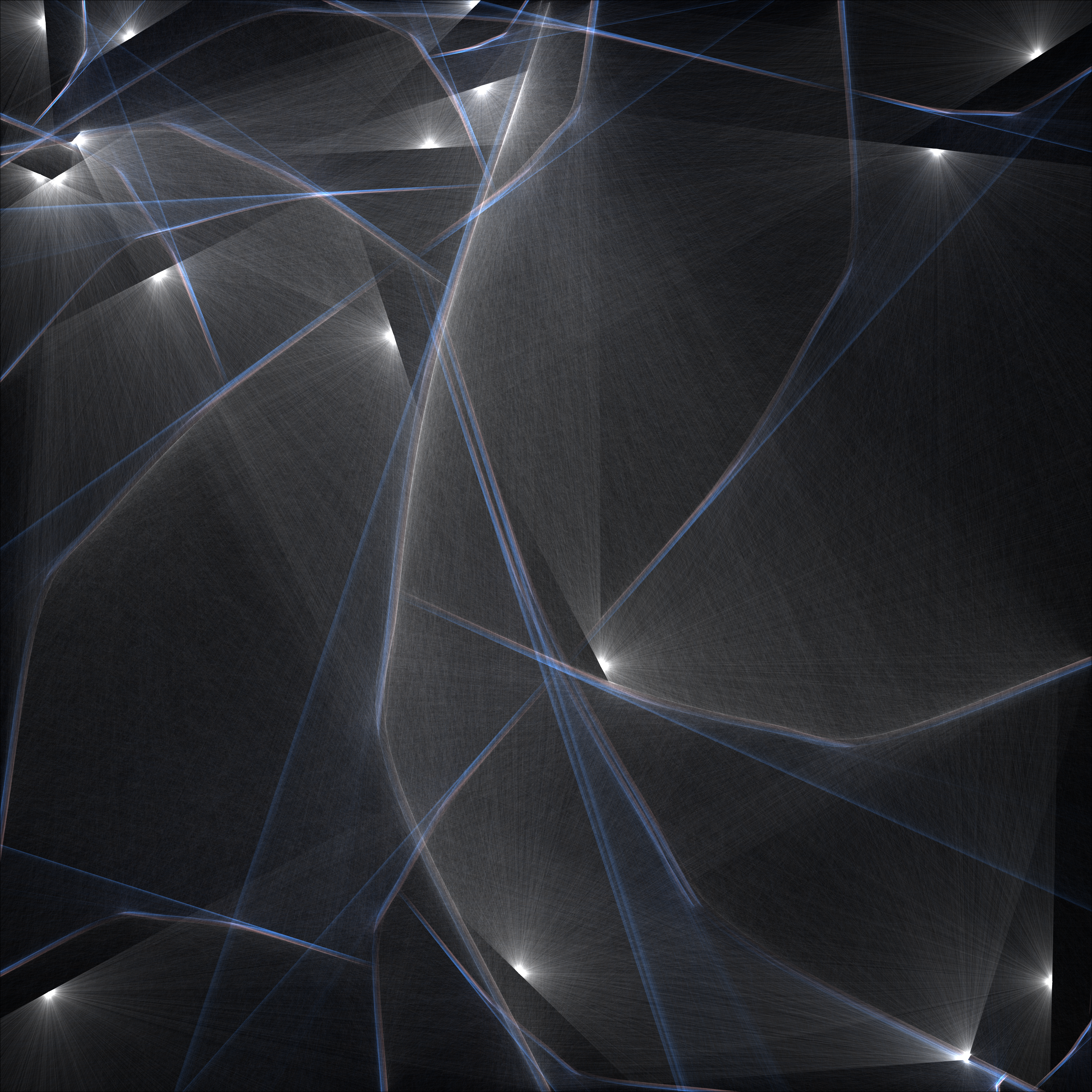 |
I wanted to fill the negative space between the curves and ideally I should like to create light structure that rest within, but I started out by putting point lights inside. The full point lights were boring and called attention to themselves. These hemi-spherical point lights were more dynamic and created binary partitions in keeping with the images more. For this image, I tried a large format rendering to test out whether I could keep the illumination reasonable at higher levels. The consequence is that the oversaturated regions of the point lights diminish in size relative to the entire image. I like how it turned out. |
Image set A. |
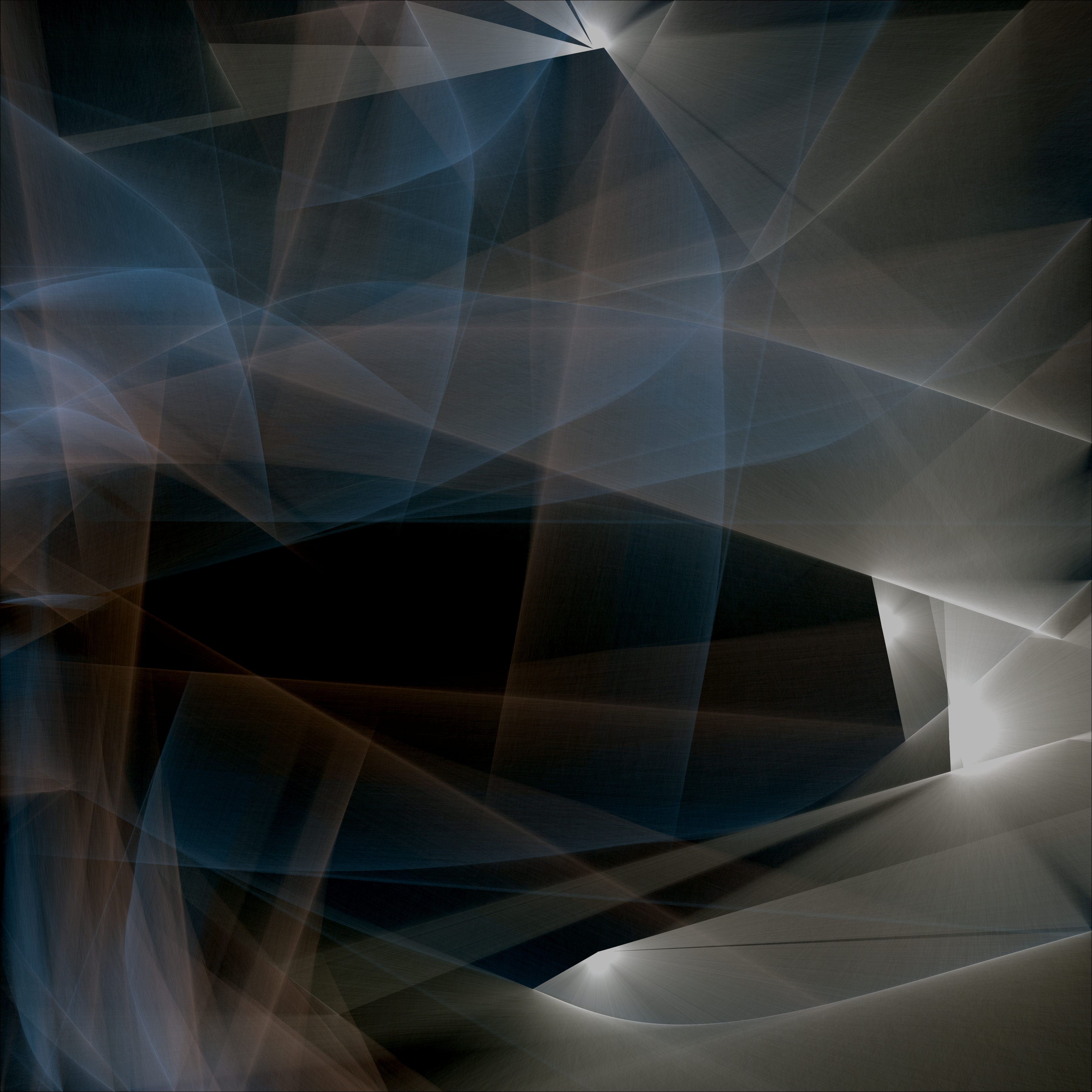 |
Another large format image, for this one I used more light beams and the colors converged more giving it a soft look. I like the waves of defined form, but my ultimate intention is to provide more definition of the plane, rather than overlays. I find that I often get distracted when travelling towards a goal and lose sight of my intentions. This can be a good thing, which leads to productive detours, but it is not research per say. The strength of a goal is that it pushes the creator to push through the unknown that comes their way, no matter how difficult. |
Image set A. |
 |
To fill in the gap, I linked up all of the structural lines, such that I could extract face polylines representing the negative space. I then tried to shrink them closer to their centroid. This did not turn out how I imagined. This image is only the negative space representations. I realized that rather than using the centroid, I could instead us a point of maxium distanct from any internal edge or what I shall try in the future will be an internal offset of a curve. I may want to re-envision everything from scratch again. There are tradeoffs to bringing along legacy code and envisioning better refeactorings. Such is life. |
Image set B. |
 |
Here is an image with no negative space fills, brightened to show the light escaping from its curve enclosure. I was experimenting with getting the brightness right for various components and compositing them together. This gets it right where the vibrancy of the colors is captured, but not to oversaturation. |
Image set B. |
 |
This image shows a very clear divide between the curve and the negative space, which is illuminated in purple. I would like to be able to shrink the negative space a bit. Also, with more branches the meaning of the purple space is not clear, which means that my geometric definitions are not being constructed perfectly. This could use some work and some more reason. |
Image set B. |
 |
This image does as well as job as any thus far at showcasing the curves and negative space. I would say that the compositing of appropriate brightness worked out, but at the same time, I think that I autocorrected it post haste in paint.net. It is on its way though. The next step is to improve the definition of the negative space and make sure the spaces are defined without errors, while also improving the automatic brightness. Also, the lines should be made finite, rather than arbitrarily long beams. It would be nice to go back to the textured definitions of paths that I developed in earlier images. |
Image set B. |
 |
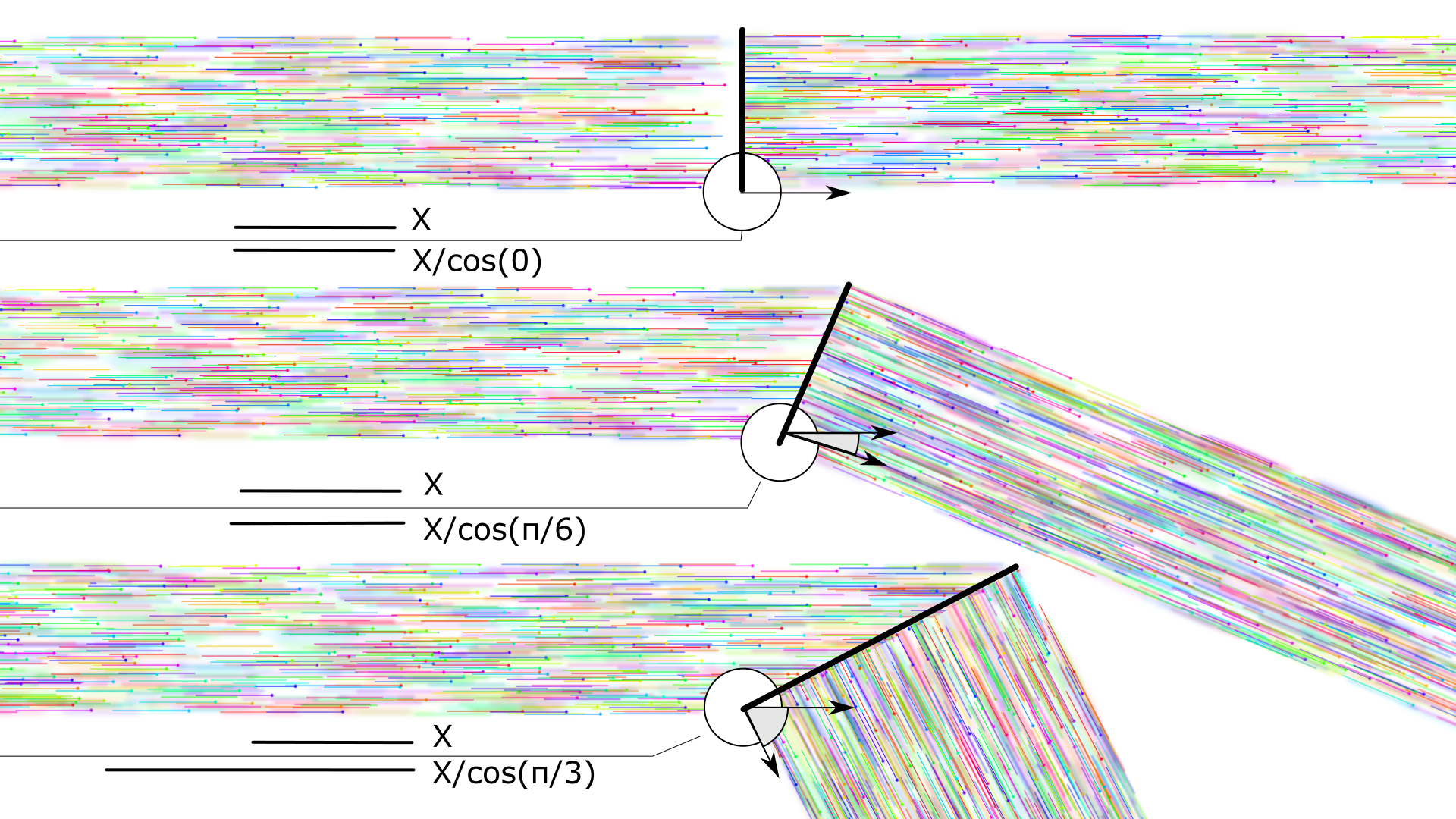
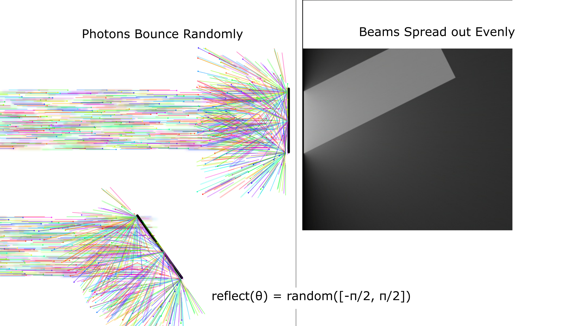
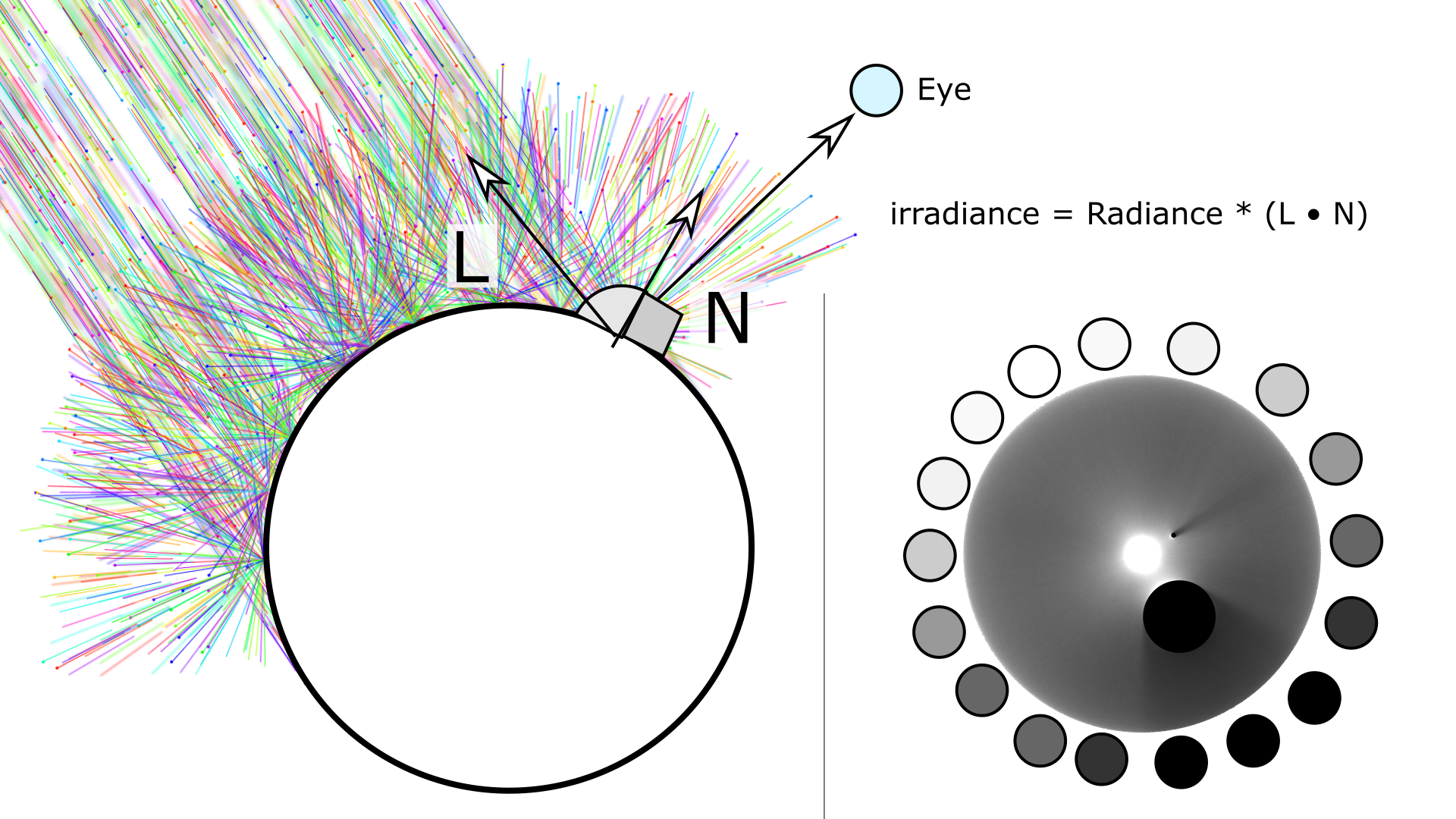
I was advised that my curves were using light as line graphic objects, rather than as a means of stroke. I tried limiting the length of the photon's journeys to around 10 pixels and I got these more prescise and sensitive curves, like a tangle of branches in a woods. I think the next step will be to formally break down the space defined by the paths and create a more specific light journey like the one I have described in my sketches. As I'm nearing the end of my journey into visuality, I hope to get back to thinking about form, games, animations, and ways to apply what I have learned to the creation of high quality images for teaching and public communication. Pat Hanrahan's slide poses the problem well. |
Image set C. |

